
I’m not averse to a few fantasy clichés on a book cover – they let me know at a glance that I’m looking at a fantasy fiction novel, and can be nice if used in creative or appealing ways. As with all clichés, however, they become eye-roll-worthy when used en masse, i.e. when several standard tropes are all packed into the one artwork. If a book tries to cover too many bases, it can start to look a little silly.
I’ve encountered a few covers that take it a bit far, but I thought it’d be amusing to go even further, and have a bit of fun with the tropes of my favourite genre… so here is my recipe for a no-holds-barred, all-boxes-ticked, epic high fantasy book cover (accompanied by examples from the most clichéd design I can muster). I’m no graphic designer, but I imagine that will add a nice level of unprofessional shine to my examples.
1. Fantasy Landscape
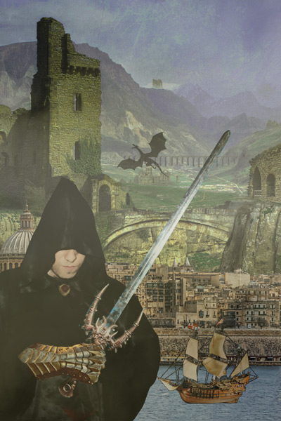
It’s a good idea to start your cover with a moody fantasy setting. This can be any of the following:
- medieval cityscape
- castle or tower
- craggy mountains
- dark forest + looming trees
- rough sea + sailing ship
If you want to go full-fantasy cliché, try to include as many of the above as possible, just to be sure you cover all your bases.

2. Hooded Figure
Now you’ve got the landscape, you need a heroic figure… and since this is fantasy, they should be wearing a robe, preferably with a cowl or hood.
A cloak or ornate armour will also suffice, as will impressive ninja-style attire… but be careful to obscure or shadow facial features. After all, who wants to have their imaginings of how the character looks spoiled by a too-visible face?

3. Weapon
It’s a rare fantasy cover that doesn’t sport a medieval weapon of some kind – bows, arrows, daggers, axes and wooden staffs are all acceptable.
I’m going to stick with the classic choice: an impressive sword. If going the sword or dagger route, a richly decorated hilt is a must.

4. Dragon
Your epic fantasy cover wouldn’t be complete without a dragon – whether the beast is shown in detail, in silhouette, or just alluded to with some scales.
I put my dragon in the background near the tower, since that seems a good spot for a dragon… and also I’m running out of space in the foreground.
5. Mysterious Symbol or Amulet
Since the Elvish scratchings on Lord of the Rings illustrations, mysterious symbols and letters have always added that extra air of mystery to a cover.
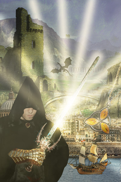
Be sure to include them, or better yet, to incorporate an amulet or piece of jewellery that has a symbolic shape or engraving, thus adding two cover tropes in one fell swoop.

6. Glowing Magic
This is my favourite ingredient: glowy magic. It adds a nice visual effect, particularly if used with subtlety… but this is a cliché recipe so subtlety isn’t the point. Whether you choose sparkles, swirling fire magic, smoky wisps or rays of light, lay it on thick.
Since I gave my figure a sword, I’ll make it a glowing, magical, vanquishes-all-evil one.
7. Corvid
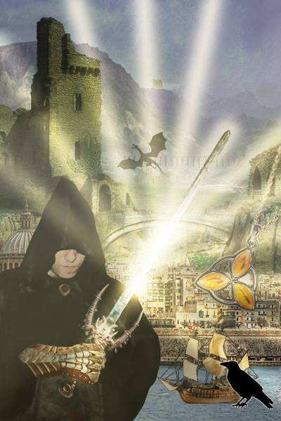
Corvids such as ravens, blackbirds and crows abound in fantasy images and stories, carrying a nice dose of symbolic and mythical baggage with them, so I recommend adding at least one corvid to your cover.
I’m going to tie mine in with the next ingredient – the border.
8. Patterned Border
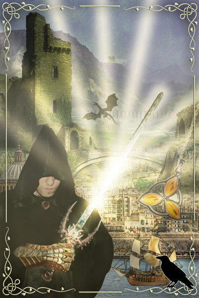
Just as every cake needs icing, a fantasy cover needs a good border. The kind of border depends on the kind of fantasy, but generally anything with curls, vines or vaguely Celtic patterns will work.
9. Title
Then comes a very important ingredient: the title. I have a more detailed post about fantasy title trends, but here’s a summary of a few common ones that I’ll be trying to work into my title:
- an “of the” construction
- mention of royalty (crown, throne, king, queen, kingdom)
- mention of a magical or martial profession (magician, dragonslayer, assassin)
- mention of a weapon or magical object (amulet, sword, knife, blade)
- mention of blood or war
- indication of something being “the last” of something
- use of a word with an un- preposition (e.g. unseen, unhewn, unmade) or generally any slightly archaic sounding word.
Here’s the one I’m going with:
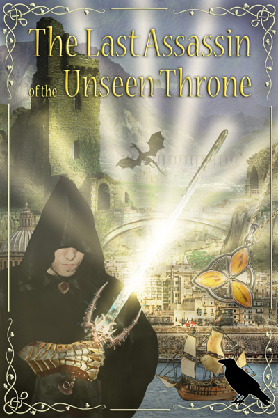
The Last Assassin of the Unseen Throne
10. Series Title
A clichéd fantasy cover has to indicate it will be part of an epic series with an equally epic title. But don’t use a word as banal as ‘series’!
‘Chronicle’, ‘Chronicles’, ‘Saga’, ‘Cycle’ and ‘Realm’ are all acceptable alternatives. Better yet, make up an entirely different word to replace the word ‘series’.
I’m going to apply more of the title trends I listed at number 9 to create my series title:
The Blood Magician Chronicles

11. Tagline
Not all fantasy covers have a tagline, but many do, and leaving one out would be a waste of a good opportunity to add another cliché. Be sure your tagline could apply to just about any high fantasy ever written.
I’ve drawn inspiration from some taglines I looked at last year to produce one that’s appropriately generic:
“A broken world. A great evil. Only the chosen can save them all.”

12. Author Name
The finishing touch is the author name. You aren’t a real fantasy author until you’ve reduced your name to multiple initials – think J.R.R. Tolkien, George R. R. Martin or J. K. Rowling. If you don’t have enough of them, just add some, and if your last name doesn’t sound fantasy-author-ish, create a pseudonym.
I’m going to go with N.R.R. Alkin, since double Rs seem to be all the rage and it couldn’t hurt for my last name to be more Tolkien-esque.
And voilà! If you’ve followed this recipe faithfully you should have one clichéd epic high fantasy cover. Here’s mine:
IMAGE SOURCES:
The Shire of Kurdistan (by Tom Blackwell, via Flickr, CC BY-NC 2.0), Looking Towards Valletta (by Neil Howard, via Flickr, CC BY-NC 2.0), Hooded Figure (by TheHilaryClark, via Pixabay, CC0), Amber Pendant (by Starbright, via Pixabay, CC0), Sword (by Just me Julie, via Flickr, CC BY-NC-SA 2.0), Antique Armour (by Maria Pop, via Pexels, CC0), Crow Vector Silhouette (by Colleen O’Dell, via Public Domain Pictures, CC0), Ship (by Alles, via Pixabay, CC0), Flying Dragon Silhouette (via Good Free Photos, CC0), Border (by Clker Free Vector Images, via Pixabay, CC0).
Admittedly it’s not the most appealing book cover I’ve ever seen… but no one could mistake it for anything other than a fantasy!
__________
Some other cover-related Thoughts on Fantasy posts:
- 5 Features That Make Me Fall in Love With a Book Cover
- Judging a Book by Its Cover: 17 Typical Features of Fantasy Covers
What do you think of multiple clichés on covers? Did I miss any vital ingredients? Feel free to mention them in the comments.

HAHAHA! This is *amazing*!! You are soooo on point. I love how you made a cover to go along with this. Honestly, once you added the corvid, I wasn’t certain how you’d add more to this image. It’s so cliche, however. I adore this,
LikeLiked by 1 person
Haha thanks! Yeah I was running out of space by the time I got to the corvid 🙂 I thought about adding a forest or a spindly fantasy tree/vine somewhere but it just wasn’t going to fit and still look like a plausible cover.
LikeLiked by 1 person
I think it’s lovely just the way it is. Now all you have to do is write it. 😉
LikeLiked by 1 person
This made me belly laugh. And yes as it progressed, I found meself wanting to know what the book would be about. The dragon alone would make me pick it up and read the blurb! The cliches are silly sometimes but do work . . . on this Captain at least.
x The Captain
LikeLiked by 1 person
Glad it got a laugh! Maybe I need to write a blurb to go with it 😉 And yeah clichés can definitely work – there are some that lure me in no matter how often I see them (e.g. I’m personally a sucker for moody medieval cityscapes, pretty borders and glowing magic!)
LikeLiked by 1 person
Careful how far you take it… next thing you know you’ll be working on the final draft 😛
LikeLiked by 2 people
Haha true! Well, at least I’d already have the cover ready to go 😉
LikeLike
This is so very, very accurate..
LikeLiked by 1 person
God Dammit! That glowing part blinded me! By the way, good work by making this most clichéd cover. You really nailed it! When i saw the Fantasy Setting I knew it would be promising
LikeLiked by 2 people
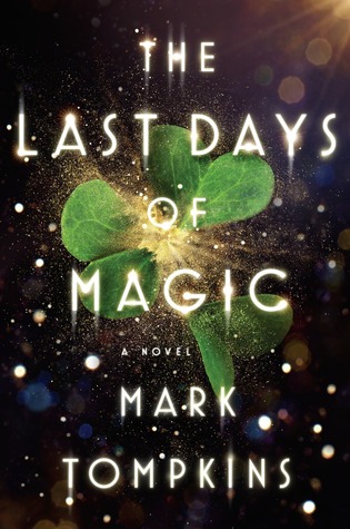
Thanks! Haha yeah I went all-out with the glow – it is one of my favourite cover clichés 🙂 For example this Last Days of Magic cover is basically all glow and it totally wooed me:
LikeLiked by 1 person
Haha! Great post and love that cover! Looks like a good fantasy cover of a book I would read!
LikeLiked by 1 person
Hahaha this is amazing and spot on! Great job.
LikeLiked by 1 person
This is a beautiful post. the whole “Hooded Figure” thing has been naffing me off for years!
LikeLiked by 1 person
Thanks! Yeah the “Hooded Figure” thing can get annoying. I’m still a big fan of wind-swept cloaks, but the standard grim-looking character in a black hood doesn’t thrill me (it won’t put me off a book, but it won’t draw me to it either)
LikeLike
It may be correlation rather than causation, but I’d swear the grim hood started appearing more and more after assassins creed went big.
LikeLiked by 1 person
True, I hadn’t even thought of that but I think it did become popular around that time… definitely some causation or correlation going on there!
LikeLiked by 1 person
An excellent job of work. This will fly off the shelves, although I do wonder if, for a truly modern cliche look, the hooded figure shouldn’t be striding purposefully towards the reader in a full-body shot with a weapon in each hand, backlit by that magical glow and looking like they’ve escaped from a Devil May Cry box cover.
LikeLiked by 1 person
True, esp. re. the weapons. After all, a sword/gun in each hand = twice as badass!
LikeLike
This article really sings to me. I could probably listen off over a dozen books that have more or less followed this step-by-step. I’d also probably read this book if it were real.
LikeLiked by 1 person
Pahahaha! This is GOLD! Thank you for taking the time and effort to entertain us.
LikeLiked by 1 person
Oh man. I would read the heck out of that series.
LikeLiked by 1 person
hahahaha this is so wonderful I couldn’t stop laughing!!! That brilliant hooded figure with the shining light *snickers*. And that tagline LOL!!! So so good!!! 😀
LikeLiked by 1 person
Glad you enjoyed it! 😀 I had fun coming up with the tagline – it made me realise there’s something about the three-part format that adds drama, even if you pick the most mundane of words (e.g. “Three cats. One dog. A mountain of lettuce.” still makes it sound like something interesting might be going on…)
LikeLiked by 3 people
hahahhahaha oh my god- that tag line is absolutely hilarious. Yes that setup is so good for epicness haha 😀 I really did enjoy it- and that bonus tagline you just made was fantastic!!
LikeLiked by 1 person
Please, please write THAT book. Three cars. One dog. A mountain of lettuce……LOL!!!
LikeLiked by 1 person
Hahaha okay, i’ll get right onto it. Maybe I should make a cover for it first though? 😉
LikeLike
I’m sold, when will you write the book?
LikeLiked by 2 people
After I meticulously plan the 7-part, 10,000-page epic series 😉
LikeLiked by 2 people
Plan for seven parts. End up writing ten, and leaving two more to be written after your death….
LikeLiked by 2 people
Haha perfect! 😂 I’ll be sure to do that.
LikeLike
you forgot colour (although you did do it) – generally washed out grey tones, but green can work for a jungle series, orange for desert – just make sure not too bright, a flash of red/purple, lettering in gold or silver !
LikeLiked by 2 people
True! Funnily enough I actually put a cloudy grey-yellow textured layer over the images, and also made the lettering a subtle yellow to imitate gold… so I guess I did those things intuitively, but I should have mentioned them because you’re right, they are also typical features! (btw if this were a physical cover I’d totally do the lettering in raised metallic gold or silver!)
LikeLiked by 1 person
It’s washed out, but missing the mysterious fog/mist. Maybe add some rolling in across the sea. Gives it a nice foreboding feel. 😉
I see you also favor the corvid cliche when choosing profile thumbnails.
LikeLiked by 1 person
Ah true some rolling mist would have worked nicely! And yeah, I make fun of the cliche but I do still love my corvids 🙂 (Though I maintain that a corvid and a dragon in the same image is absolute overkill!)
LikeLike
Though it does make me want to write a story with a corvid and a dragon as mcs so there would be a perfectly good reason to have both on the cover. Hehe
LikeLiked by 1 person
Great fun, thanks for the post. It shows how you really do need to be careful not to throw in everything but the kitchen sink.
LikeLiked by 1 person
Yes true – though I’m beginning to think that even if you do throw everything in people might still be drawn to it, since the clichés exist for a reason… but it probably wouldn’t be the most successful strategy, and I’m generally a fan of covers that don’t try to cover too many bases at once 🙂
LikeLiked by 2 people
Cliche for good – Lets people know what the book contains and if it fits their interest.
Cliche for bad – publisher puts things on the cover that aren’t in the book in order to draw more people in.
I admit I do judge books by their cover. They can tell me how much the publisher values the book (how impressive the cover is), what type of book is it (hard sci fi, epic fantasy, etc.), when was it written/published (what style fits with what year although this gets lost for reprints), and other things I am sure I can’t remember right now. I don’t hold a cover against a book, there are many of great books with poor covers. But with so many things to read, covers are a quick and easy way to choose where to start.
A major cover point for me is I will read anything with a Thomas Canty cover. I have either loved or liked every book with one of his covers, with the exception of one series.
LikeLiked by 3 people
Yes that’s terrible if a cover has things on it that aren’t in the story – it’s just misleading (e.g. if a cover has a dragon on it there’d better be dragons in the book!).
I also won’t hold a bad cover against a book if it’s been recommended or well-reviewed – in fact I just finished reading a good book that had a cover I really didn’t like. But in other circumstances I will judge by a cover – as you said, it’s a quick way to gauge the genre/sub-genre, age, and how much the publisher values it. I can’t help but be turned off by unprofessional-looking or ugly covers. Some covers are also so captivating or visually interesting that they catch my attention, and when that happens I really want the book to be good (but even then, that cover won’t persuade me to read it if it’s got lacklustre reviews).
I don’t know any Thomas Canty covers, I’ll have to look them up!
LikeLike
Well. I’ll definitely be using this to design all my fantasy covers going forward.
You kinda skewered me and my series on some of those cliches.
LikeLiked by 1 person
I just blogged about how to build a fantasy title, and it’s amazing how you hit a lot of the same points using a completely different method. 🙂 https://johnmolsen.blogspot.com/2017/07/whats-in-name.html
LikeLiked by 1 person
That’s a good method you used – certainly more scientific than mine! Nice to see we came up with many of the same words. I was intrigued to see ‘secret’, ‘long’, ‘shade’ and ‘fate’ on your list though. When I think about it, all of them definitely make sense, I just wouldn’t have thought of them off the top of my head. I feel like I’ve seen more books with ‘shadow’ rather than ‘shade’ in the title… though I guess ones formulated in the “a darker shade of…” style would account for all those shades!
LikeLike
Wow! Even when you are doing a parody, you do a great job! At full size, I’d definitely stop and take a look at the blurb.
I only had two niggles — I think you over-glow. I’d keep the glow to the sword, and then cast a bit of shadow around the immediate vicinity so that the other elements don’t get outshined. The other thing is that when I shrink this to thumbnail size, I can’t read the title or anything.
I can’t think of much you missed! It’s really interesting how the SFF cover has moved on, though. When I was a kid, fantasy would definitely have cleavage showing somewhere. Maybe the hooded figure could have a cut-out, like Marianne Faithful or something? Also, I don’t know when the corvids and the curly-cues came into fashion, but you are definitely right, they are here. I don’t really care about the crows (although yours looks quite friendly and ready to share some secrets or some eyeballs), but I can’t get enough of scrolls and flourishes! Dragons, it appears, are timeless, and thank all the fantasy gods and goddesses for that, LOL.
LikeLiked by 1 person
Thanks! I wanted the cover to look believable so I got a bit more fussy than I probably needed to be for the sake of a parody 🙂
Yeah, the glow does overpower everything else… to be honest I prefer more wispy subtle glows on covers, and intended to centre it on the sword, but I couldn’t figure out how to do that easily in photoshop so I got lazy and did straight rays 🙂 It does make a poor thumbnail – I like covers with contrasting colours that highlight the title more for that very reason, but I figured this way it would give it a more old-school washed-out fantasy feel with the imitation-gold lettering.
Actually a problem I have with a lot of older fantasy covers is that they look terrible as thumbnails on Goodreads… I suppose because they were never intended to be viewed that way. SFF covers have definitely changed a lot in the past few decades (certainly less cleavage as you said! I’m glad that trend disappeared though…).
I enjoy scrolls and flourishes too – actually anything with an old parchment look usually tempts me. And yeah, I think as far as fantasy cover go, dragons will live forever!!
LikeLiked by 1 person
I love this! And agree with so many commenters, as cliched as the cover is, I found myself totally wanting to know what the story was about. We are all fantasy addicts pre-programmed to love this. lol.
Like Gina above, I would automatically pick up any book with a Thomas Canty cover (though never read all of them… yet). Fantasy is such a visual genre, even if most of it is built in our minds through the words we read. So, of course, the mysterious and magical cover MUST be the gateway to lure us in!
I will totally keep in mind not to go overboard though in my future covers. Then again, if this thread is any indication, maybe I should! 😉
LikeLiked by 1 person
Yeah we are definitely pre-programmed to love this 🙂 As much as I make fun of clichés there are so many that regularly get my attention and pique my curiosity!
It is a very visual genre, and it’s fascinating when people put those imagined scenes to paper or film. Fantasy art is in itself such a big thing, and there are so many talented artists out there (e.g. I always enjoy checking out the winners of the Chesley Awards each year).
As for going overboard… before I put together this cover I fully expected it to look dreadful and scare everyone off, but it didn’t quite turn out that way! Still I’d err on the side of a few less clichés if I were making a cover for a real book 😉
LikeLike
Reblogged this on AM Justice and commented:
Nicola at Thoughts on Fantasy puts together an absolutely brilliant instruction manual on how to make a cliched fantasy book cover. #Designtip!
LikeLike
I would totally buy this! 🙂
LikeLiked by 1 person
Hahahaha this is gold! I so much agree with everything you said. It’s not that I don’t love fantasy covers – I do! It’s just that, sometimes, they get a bit too homogeneous and every single book looks and sounds the same. So how do you know which one to choose? Reviews, usually…
I have to admit I’m a sucker for those patterned borders, hooded figures, titles and dragons, though! If you have those in your book, and it looks seemingly professional and badass, you bet I’ll pick it up and read the synopsis. I don’t care if it’s cliché. I much prefer it to the YA paranormal or NA romance covers with a photoshopped model/muscled guy in the cover. Ew.
Loved the final product! Reminds me of old school fantasy books.
Amazing post and thanks for the laugh! 😀
LikeLiked by 1 person
Thanks!! Yes, if all the covers and blurbs start to look the same it really comes down to reviews and recommendations… which are probably better for choosing a book anyway 🙂 So I guess as long as the cover is not off-putting and lets you know its a fantasy, it’s done its job! (Though I do love particularly beautiful or striking covers).
Haha yeah I’m also not a fan of the muscled male model thing… cover him up with a cloak and give him a medieval weapon though and you might have my interest piqued 😉 In general though I think I’m more drawn to covers with female figures on them. There are also some great YA ones with no figure at all and just interesting objects or textures on them – I love those!
LikeLiked by 1 person
You’re welcome! 🙂
Oh yeah, cover the guys up and I’ll be swooning LOL Hate shirtless shots… Just look cheap and unprofessional, to be honest. I don’t really like when faces are shown either. I like to imagine the characters in my own head and those interfere with that.
Me too! Especially if they actually turn out to feature awesome female characters in them 🙂
LikeLiked by 1 person
Haha yeah – shirtless shots do tend to have a cheap vibe about them, I hope the genres that use them move on to a new cliché soon so I can buy them without wincing! I’m not a huge fan of faces either… like you said, they make it hard to imagine the characters differently, and I also feel they rob the cover of a bit of magic and mystery (if they’re not at least partially obscured)… not sure why.
And I definitely second that – I’m always a fan of awesome female characters!! 🙂
LikeLiked by 1 person
Oh yeah, the covers are the main reason why I’ve never felt tempted to try them… Even if I hear super nice things!
I think so too. The hidden faces definitely help build up the mystery and expectation. When they’re in full display, they can actually get a bit distracting and ruin it for me. I want my characters to be faceless at all times XD
LikeLiked by 1 person
This was pure gold!
…however, once I find it again, I will photograph and send you the single most cliché filled fantasy cover I have ever seen. No, it did not include the corvid or the hooded figure, but what the scene implied screamed CLICHÉ so much that I need to describe it: 1) tower in the background, with an apparent storm brewing (check) 2) dragon in the foreground (check) 3) warrior riding said dragon (check) 4) sword (check) 5) barefoot, sexy elven female sitting behind said warrior…
Did NOT want to read it. Sadly, don’t remember the title, but will check it out!
LikeLiked by 1 person
Haha it sounds amazing! And like it ticked a bunch of cliché boxes I didn’t even think to include 😀 Hope you find it, I’d love to see it!
LikeLike
Dear Nicola (and friends),
I have been sent as an ambassador to ask:
Please join us at goodshowsirDOTcoDOTuk, where we make fun of real examples of this every day.
You’ve independently duplicated categories we have, and I’ll bet there’s some cover in our vast database that looks exactly like that.
Commenters are chill and funny. Hitting “Random Terrible Cover” in the sidebar will always make you laugh. And sometimes cringe.
You’d be more than welcome. At least take a peek at a few for free amusement, it’s SFW.
flourishes ridiculous hat with giant feather, bows extravagantly, and swoops cloak away in proper fantasy fashion
LikeLiked by 1 person
Haha, why thank you for the invite, good sir!
I’ve actually come across Good Show Sir once before (and enjoyed perusing the bizarre covers – it’s an impressive collection!) but I just had another look and a laugh – some truly priceless specimens, more amusing than anything I could invent (e.g. the tagline on this one puts mine to shame).
I should sign up to the RSS feed and check it out more often. And if I stumble across a physical copy worth photographing and submitting, I’ll be sure to throw it into the mix!
LikeLike
Nicola, come over and say hi soon even if you don’t have time to chat. We’re all agog at how well you nailed this and would welcome you in our merry band.
Invitation extended to your commenters as well.
We
make fun ofanalyze both SF and fantasy; new stuff M-TH, reruns F, closed Xmas-New Year’s.LikeLiked by 1 person
Great fun–but alas, I’ve seen some that are almost this bad and meant to be serious.
LikeLiked by 1 person
I’d read it.
LikeLiked by 1 person
Pingback: Interesting Links for 28-07-2017 | Made from Truth and Lies
Pingback: Friday Links – Sheryl R. Hayes
This is HILARIOUS. Excellent post! The resulting cover may be cheesy, but it’s oddly comfortable among so many other covers I’ve seen, especially among indie books. O_O
LikeLiked by 1 person
More people ought to just do a Struzan. Can’t go wrong with a Struzan.
LikeLiked by 1 person
ok so i followed the instructions
LikeLiked by 2 people
Hahahaha wow… it’s perfect!! 😂 There’s so much going on it hurts my eyes. Your font choice is spot on, and I LOVE your tagline (just the words “the final battle will begin” give me deja vu). Can’t wait to see if the Last Blade of the Crow Lords defeats all those Raven Blackdragons with his Sky Tattoo…
LikeLike
Lol! Good one! So true all you said. The title would’ve caught my attention.
LikeLiked by 1 person
That’s one way to put it.
LikeLike
Disgustingly close to reality.
LikeLike
This is way too real 😀
LikeLiked by 1 person
Reblogged this on From 1 Blogger 2 Another.
LikeLike
Reblogged this on salt and iron and commented:
This gem popped up in my Facebook memories today, so thought I’d share it here to give you all a laugh. Those of you who follow(ed) my banned books blog may recall my strong feelings about book covers, especially the travesty that was the Twilight cover treatment a newer edition of The Woman Who Rides Like a Man received.
LikeLike
Pingback: Good Show Sir - Only the worst Sci-fi/Fantasy book covers
Eh, I would SO read this book.
You can design my next book cover.
I think what does it for me is the way the mountains mysteriously fade into ominous blue cloud cover. I’m a sucker for that.
Also, we appear to be moving back in time as we move toward the background. The ship is Age of Exploration, the city is Renaissance, the tower is Medieval, and the mountains are pre-historic.
I guess cliches are cliches for a reason.
LikeLiked by 1 person
Haha, maybe I should follow my true calling as a book designer 😉
I didn’t think about the fact it kind of moves back in time with the different layers of settings – but true, it really is a mixup of different looks and periods. I actually really liked the image with the fading mountains when I found it (this is the original). It would have made a nice background just by itself – but I had to add more clichés!
LikeLike
Pingback: FANTASY COVER ART: AGAIN WITH THE CLICHES… – Book Cover Insanity
I would buy it! You forgot the sidekick person/pet/scantily clad female and almost always there’s a horse or some sort of mount there.
LikeLiked by 1 person
True, maybe I could kill two birds with one stone and add a scantily-clad female riding a horse? 🙂
LikeLiked by 1 person
🙂 Yeah, probably!
LikeLiked by 1 person